Logo and tour admat
DESIGN CONCEPT
As Billy Strings was exploding in popularity after winning a Grammy, we were honored to be asked to design his tour creative. We knew we wanted our concept to convey his multifaceted personality through imagery, as well as design a logo that felt representative of his style.
DESIGN DEVELOPMENT
The process of working with his team was really creative and collaborative. We were given great photos of him to work with - just being his joyous, quirky self. From there we layered and wove the photos together to create a triptych image that really employs movement in what felt like a clever way. The logo design was another opportunity to showcase his personality through custom typography. Much thought and experimentation went into developing the colors until we landed on this triadic scheme.

DIGITAL MARKETING
Using consistent photography and unifying the designs with the main admat, we created additional templates. These were used across all social media platforms for the localized admats that promote each tour date individually.
PAST YEARS
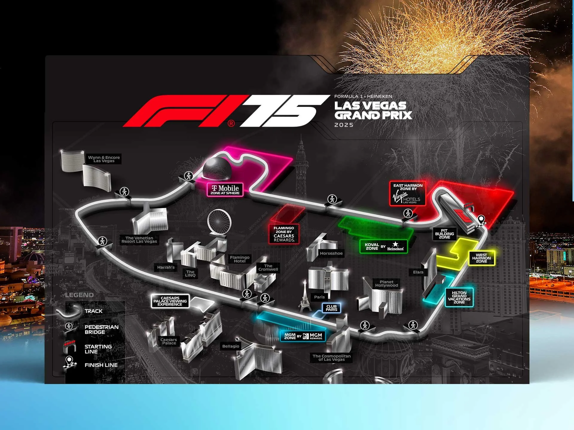
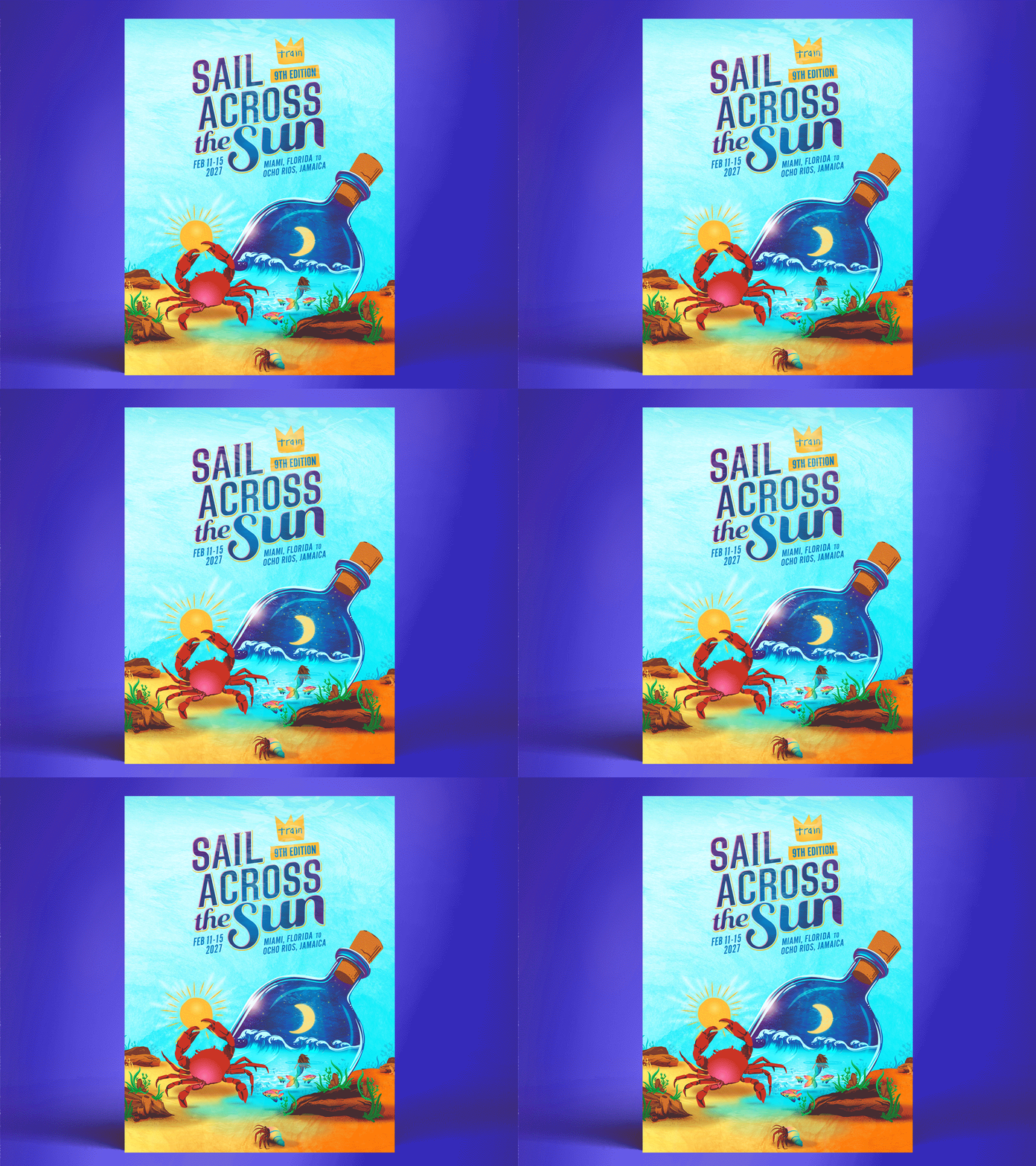
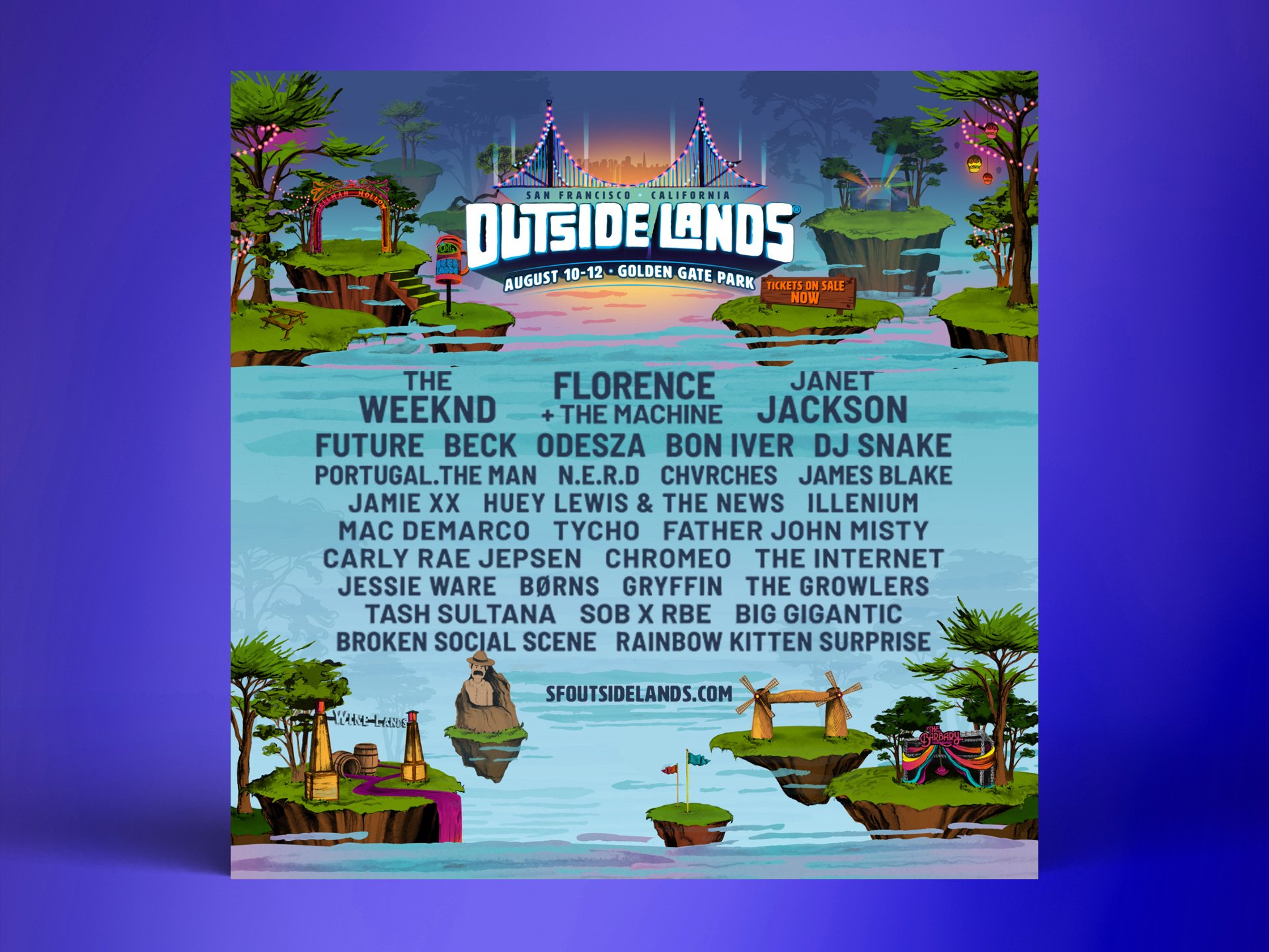
We created additional admats for various other tours that each had their own look and feel in order to differentiate the marketing campaigns.


