
FESTIVAL IDENTITY CONCEPT
We were delighted to be approached to design the festival identity for the inaugural Blue Note Jazz Festival in Napa, California. Taking place on a beautiful vineyard in Napa Valley with musical roots in R&B and soul, a Robert Glasper residency and Dave Chapelle hosting, this was a welcomed and exciting design challenge for us. In collaboration with our client the intention was to create a concept that was vibrant and welcoming while feeling like a sunny day in Napa Valley.

DESIGN DEVELOPMENT
Once we established the design elements (both representational and abstract) we created our admat composition sketch. It was important to design an identity that would have a lot of versatility for creating marketing and onsite assets while also being visually exciting and having some depth to it. We also designed a new logo lockup working from the existing iconic Blue Note logo.
From the concept sketch we illustrated and vectorized our admat in Adobe Illustrator, adding in textures and shadows to create a feeling of depth. We then began the process of creating a color scheme for both the overall full lineup poster and the single day lineup marketing assets. We worked on type explorations and came up with several solutions for containers and typography to support the visual hierarchy.

FINAL BRAND & STYLE GUIDE
After finalizing the admat design we established a toolkit of the visual elements. The style guide serves as a reference tool, streamlining the content creation process for our clients by cohesively laying out logo usage guidelines, color palette, typography, supporting graphics and background elements. The components of this guide and its effectiveness are at the forefront of our mind throughout the entire creative process.


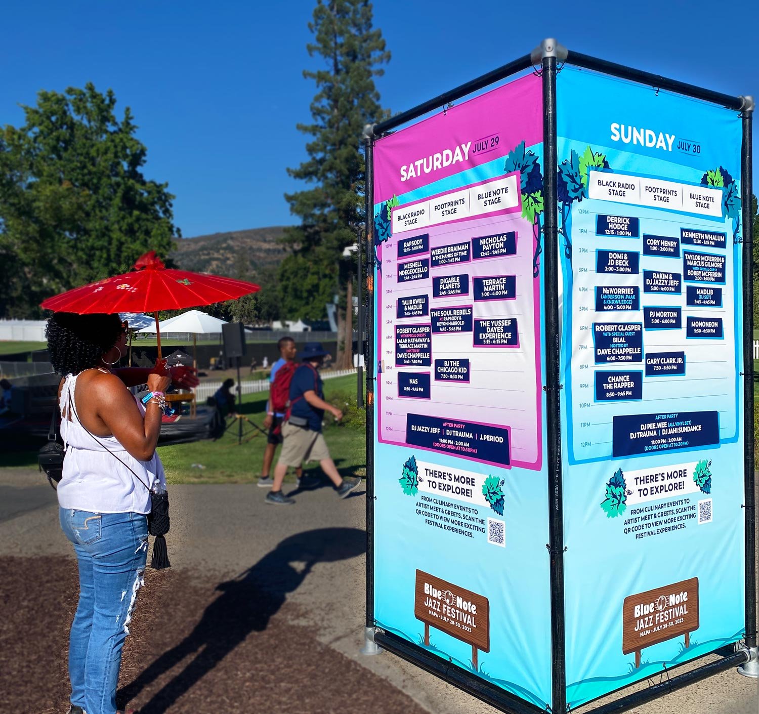
ONSITE PRINTED MATERIALS
We take pride in delivering seamless design solutions for our clients’ events, while upholding brand integrity and maximizing functionality. For Blue Note Napa we created a custom festival patron site map, daily schedule grids and their program guide design. We designed all of their wristbands and laminates, as well as their onsite signage and kiosk designs.


MERCH DESIGNS
Designing a festival merch mix is a creative and collaborative process that involves highlighting the brand while also understanding the target audience and the goal of making the designs appealing to the fans. Once designs are selected to finalize we weigh in on blanks and color combinations, going through rounds of revisions until we deliver final files to the printer.


STAGE SCRIMS
We designed both animated digital stage backdrop designs and static printed scrim designs for the two main stages. Printed scrim designs are intentionally designed to have bright, bold colors that frame the stage and invite the audience in (and look good in photos). The digital scrim designs allow for the brand to animate as well as editable type with the artists name or interstitials.