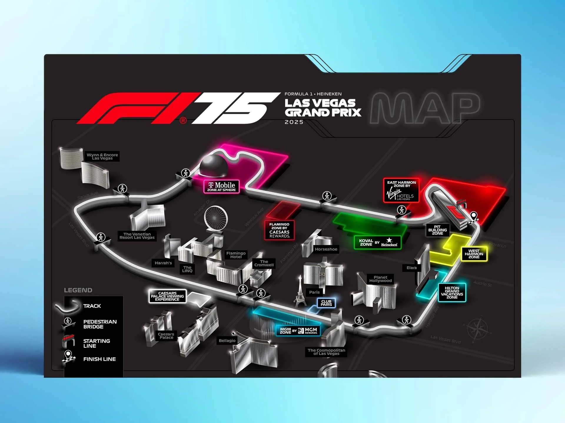

FESTIVAL IDENTITY CONCEPT
We were honored to be approached to design a new identity for the legendary Blue Note Jazz Festival in New York. This project was a really enjoyable collaboration with a great team of people. Our intention for all the festival identities we create is to design the art to be a visually exciting, relevant and successful toolkit.
Collectively we wanted to breathe some new creative life into the artwork by giving it an exciting new look and feel. Our goal was to visually convey the energy of jazz and the meaningful and immersive experience of being at Blue Note, along with paying homage to New York.

DESIGN DEVELOPMENT
We decided to have the Washington Square Arch be the centerpiece of our composition as this iconic landmark is part of the festival footprint. To bring the energy and movement of jazz into our design through shape and color we drew shapes falling out of the arch illustration. The idea was to marry the representational and the abstract with a slightly random and chaotic feeling not unlike jazz music itself. The New York skyline silhouette rests in the footer of the admat and acts as a frame for the URL call to action.

FINAL BRAND & STYLE GUIDE
After finalizing the admat design we established a toolkit of the visual elements. The style guide serves as a reference tool, streamlining the content creation process for our clients by cohesively laying out logo usage guidelines, color palette, typography, supporting graphics and background elements. The components of this guide and its effectiveness are at the forefront of our mind throughout the entire creative process.

MERCH DESIGNS
Designing a festival merch mix is a creative and collaborative process that involves highlighting the brand while also understanding the target audience and the goal of making the designs appealing to the fans. Once designs are selected to finalize we weigh in on blanks and color combinations, going through rounds of revisions until we deliver final files to the printer.