FESTIVAL IDENTITY CONCEPT
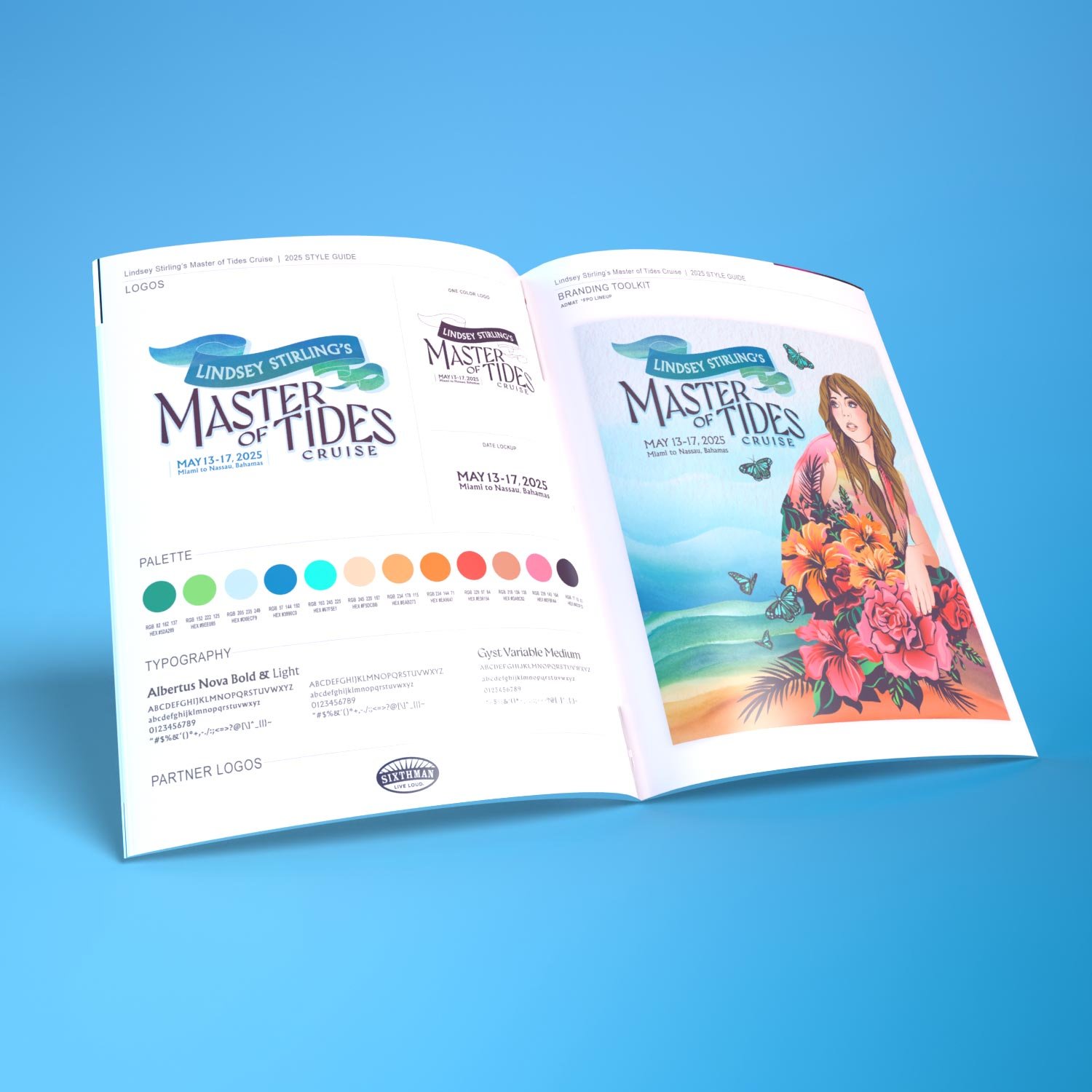
For the inaugural Master of Tides cruise concept we center around an illustration showing Lindsey Stirling with tropical flowers, palm fronds, sand and ocean tides contained within her illustrated silhouette. The colorful butterflies that surround her are a wink to her Duality album art graphics. This is a tropical cruise so we really wanted the colors and feel of the artwork to reflect that.
DESIGN DEVELOPMENT
We created our admat composition sketch first to get the layering of the natural elements within her silhouette just right. From there we illustrated and vectorized the design. When illustrating graphic elements we’re always keeping in mind how we’ll utilize highlights, shadows, color and texture to enhance depth and form, making them feel three-dimensional and visually appealing. Next we worked on type explorations and came up with several logo concepts before settling on the chosen logo to develop, apply color to and finalize.

FINE ART & COLORS
We knew we wanted to incorporate some texture and painted elements into this project, so we painted the beach and ocean waves in watercolor. Then we scanned and added in as the background to our digital file. The color scheme leans on a tropical base of sand, water and jungle with pops of bright hibiscus pinks, red and orange.
FINAL DESIGN & STYLE GUIDE
After finalizing the admat design we established a toolkit of the visual elements. The style guide serves as a reference tool, streamlining the content creation process for our clients by cohesively laying out logo usage guidelines, color palette, typography, supporting graphics and background elements. The components of this guide and its effectiveness are at the forefront of our mind throughout the entire creative process.
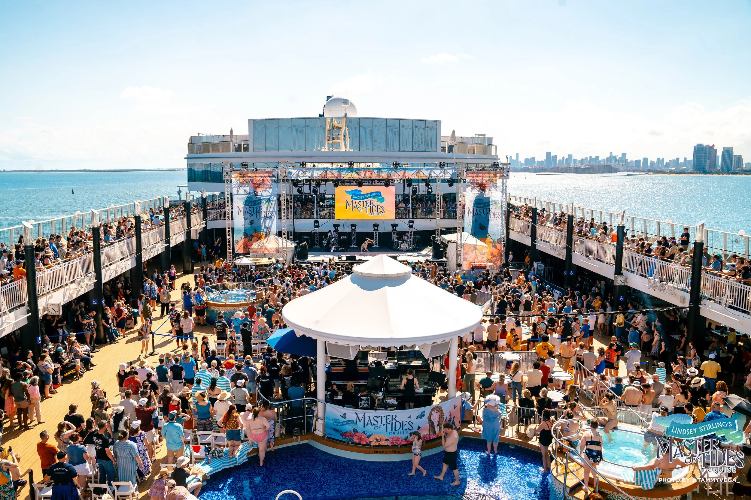
ONSITE SIGNAGE DESIGN
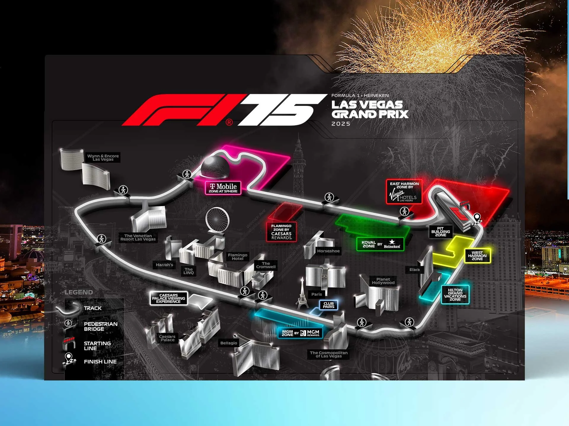
Signage is where branding becomes fully immersive. Once the identity is established, we bring it to life across the environment—transforming functional elements into moments of connection and storytelling. For Lindsey Stirling’s Master of Tides, signage carried the brand throughout the event space with vibrant colors and bold visuals. From stage scrims to wayfinding signage, press backdrops, and even branded drumkits, each piece was thoughtfully designed to enhance the rich, tropical vibe throughout the event.

MOTION GRAPHICS
For the final admat we animated the butterflies flying around her and added some motion within the flowers and palm fronds.


