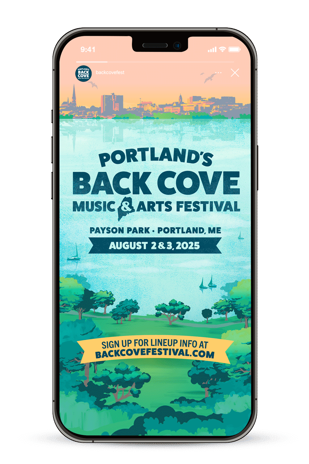
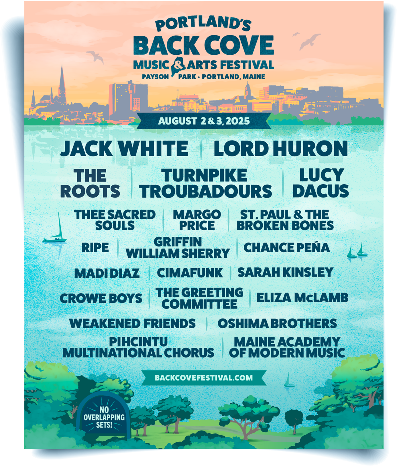
FESTIVAL IDENTITY CONCEPT
Inspired by the natural beauty of Payson Park, the festival’s visual identity places viewers at the heart of the experience—overlooking the shimmering waters of Back Bay, surrounded by lush summer greenery, with the Portland skyline stretching across the horizon. The illustrations and colors capture the essence of a vibrant Maine summer, evoking a sense of warmth, energy, and local charm, with a subtle reference to Portland’s iconic old port signage. The sky transitions toward the golden hour, adding depth and ambiance to the illustration. Check out our creative process reel here.

DESIGN & LOGO DEVELOPMENT
From the start, we knew we wanted to incorporate the outline of Maine and draw inspiration from the classic signage found downtown in the Old Port—an inviting and authentic starting point for the logo design process. After exploring a range of iterations, we arrived at a clean, classic sans serif version, incorporating the state outline. This design feels both approachable and steeped in Portland’s character. To echo the charm of hand-painted signs along the waterfront, we added texture and a subtle drop shadow. From there we illustrated our admat sketch, then applied color. The chosen color palette reflects the warmth of a Maine summer, with bright greens and blues complemented by striking pops of sunset yellows and pinks, creating an inviting and lively aesthetic.


ILLUSTRATION
Bringing this vision to life began with hand-sketched layouts of the park, bay, and skyline, carefully mapping out key elements of the scene into our composition. These sketches were then illustrated and colorized to create a cohesive yet dynamic identity. Additional supporting design elements representing Portland and Maine were created to reinforce the festival’s identity and location.

FINAL BRAND & STYLE GUIDE
After finalizing the branding we established a toolkit of the visual elements. The style guide serves as a reference tool, streamlining the content creation process for our clients by cohesively laying out logo usage guidelines, color palette, typography, supporting graphics and background elements. The components of this guide and its effectiveness are at the forefront of our mind throughout the entire creative process.


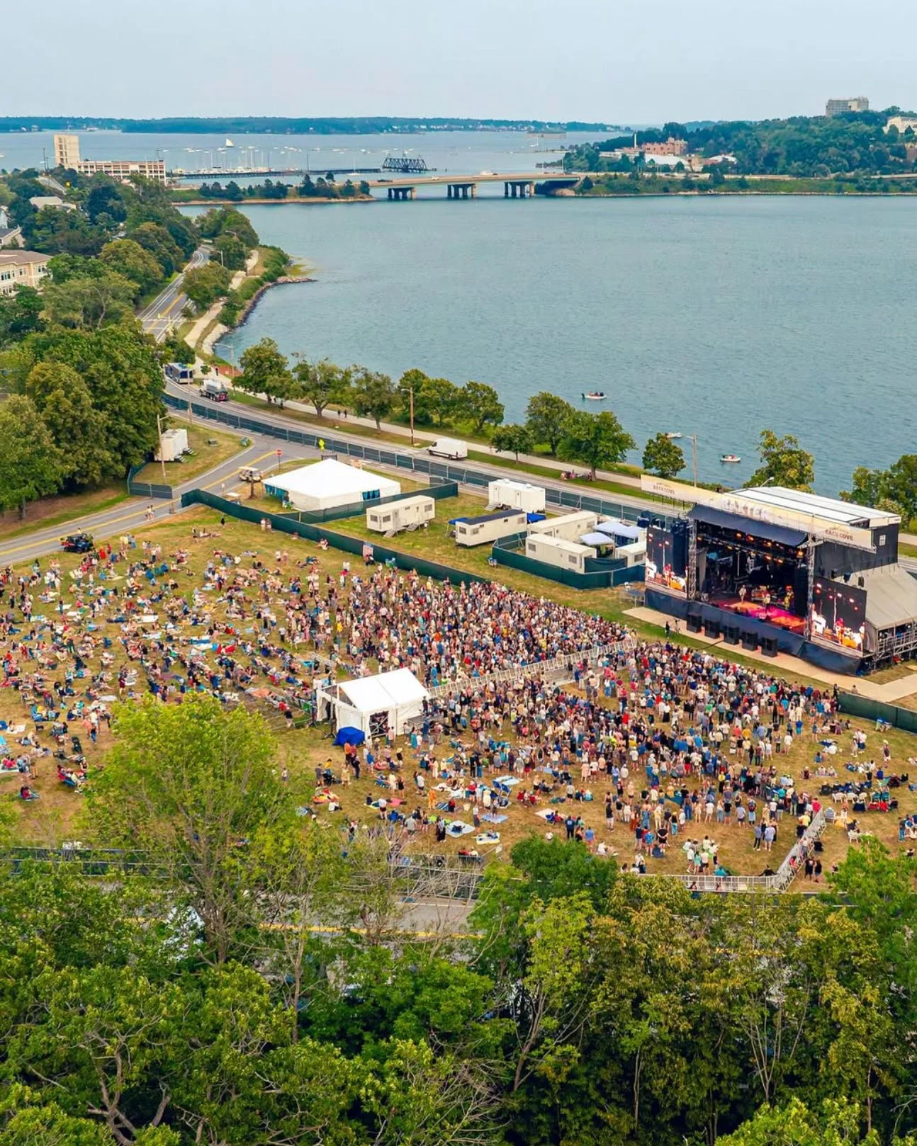
ONSITE PRINTED MATERIALS
For the inaugural Back Cove festival, we helped design some of the onsite materials that brought the brand to life across the grounds. This included stage scrim designs, as well as a full set of signage templates for wayfinding, food and beverage, and other patron touchpoints. Together, these elements created a consistent, recognizable look that tied the festival together and made the brand feel present throughout the experience.