
FESTIVAL IDENTITY CONCEPT
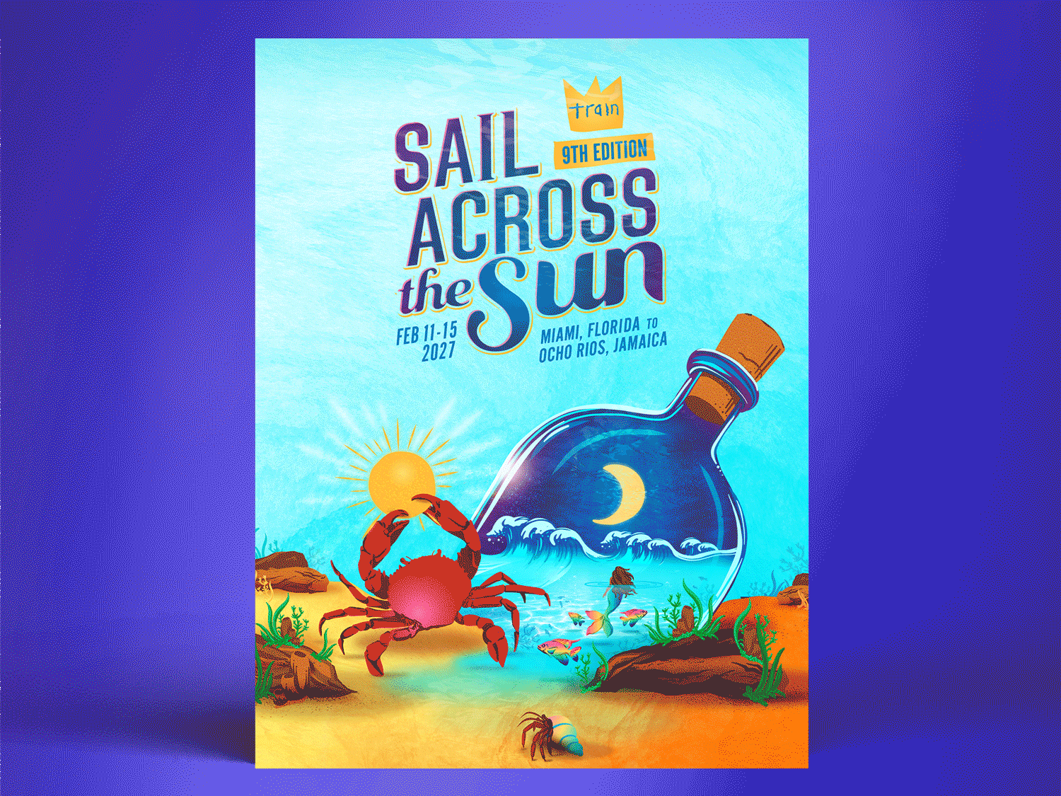
The 2025 Sail Across the Sun concept we created centers around a tropical underwater world with new creatures and characters, building on our previous years branding and logo design. We had fun in the conceptualizing phase exploring the idea of creating a day and night time version of the admat. From a marketing perspective we knew this would also diversify the possibilities for content creation, giving the branding more legs. Our goal for any festival identity we create is to design a visually exciting, relevant and successful toolkit for our clients.

DESIGN DEVELOPMENT
In our final concept sketch we created depth and an ocean floor to ground the elements through atmospheric perspective. We wanted to add a nod to San Francisco (where headliner Train is from) by having the Golden Gate Bridge contained as the ‘message within the bottle’.

ILLUSTRATION
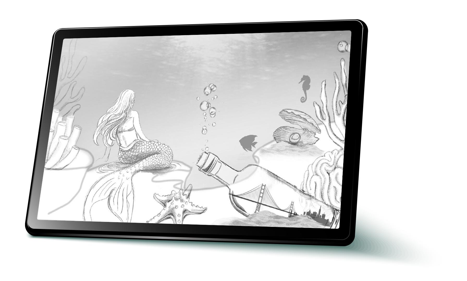
We drew the mermaid, coral, fish, and seaweed first with pencil, then we brought the sketches into Adobe to illustrate and vectorize them. When illustrating graphic elements we’re always keeping in mind we’ll utilize highlights, shadows, color and texture to enhance depth and form, making them feel three-dimensional and visually appealing.


FINAL BRAND & STYLE GUIDE
After finalizing the admat design we established a toolkit of the visual elements. The style guide serves as a reference tool, streamlining the content creation process for our clients by cohesively laying out logo usage guidelines, color palette, typography, supporting graphics and background elements. The components of this guide and its effectiveness are at the forefront of our mind throughout the entire creative process.


ONSITE SIGNAGE DESIGN
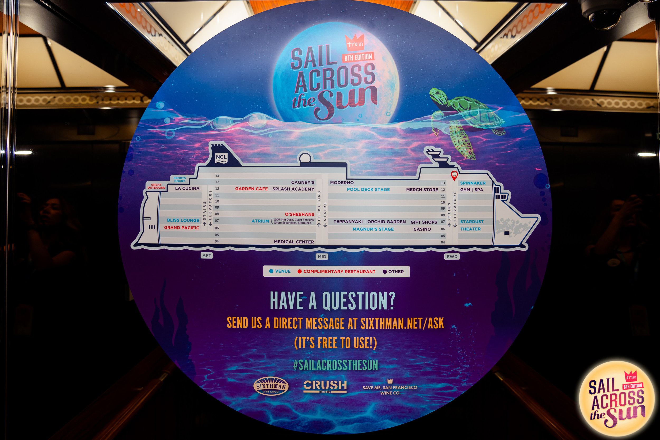
Signage is where branding becomes fully immersive. Once the visual identity is established, we focus on carrying it through every physical touchpoint—making the environment feel visually cohesive and connected to the story. For Sail Across the Sun, that meant designing signage as a continuation of the underwater world we’d created—rich with vibrant color and layered storytelling. We adapted the artwork to fit large-scale pieces like stage scrims and environmental graphics, while ensuring wayfinding stayed easy to follow, visually aligned, and adapted to the flow of the ship.

MOTION GRAPHICS
For the final step in the project we created the two different iterations of the admat. The light and color streaming through the water changes dramatically from day to night, the colors change and the sun becomes the moon. We also animated the admat to flip from day to night which was really fun.

PAST YEARS
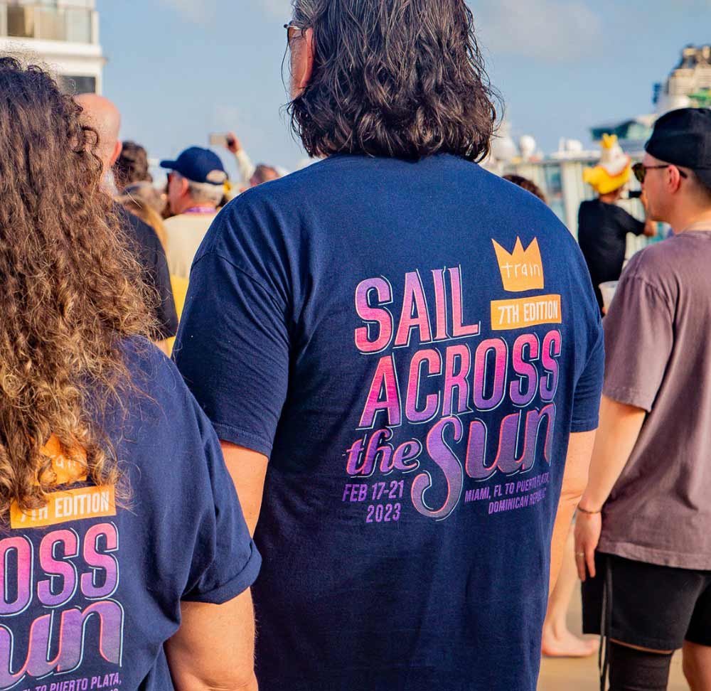
In 2024 we were tasked with creating a new logo and branding for Sail Across the Sun. Our intention for the logo design was to give it a simple, timeless feel through strong typography while also being versatile and highly legible.
This concept has marine life and mermaids revolving around a floating bottle. We illustrated various marine life, mermaid silhouettes and birds that could be distributed during the content design process to support the messaging.